Background
As a way to expand my skillset and to stay motivated, here are a few landing pages for concepts I found interesting and follow the best practices for an effective landing page not only from a strategic but a design perspective.
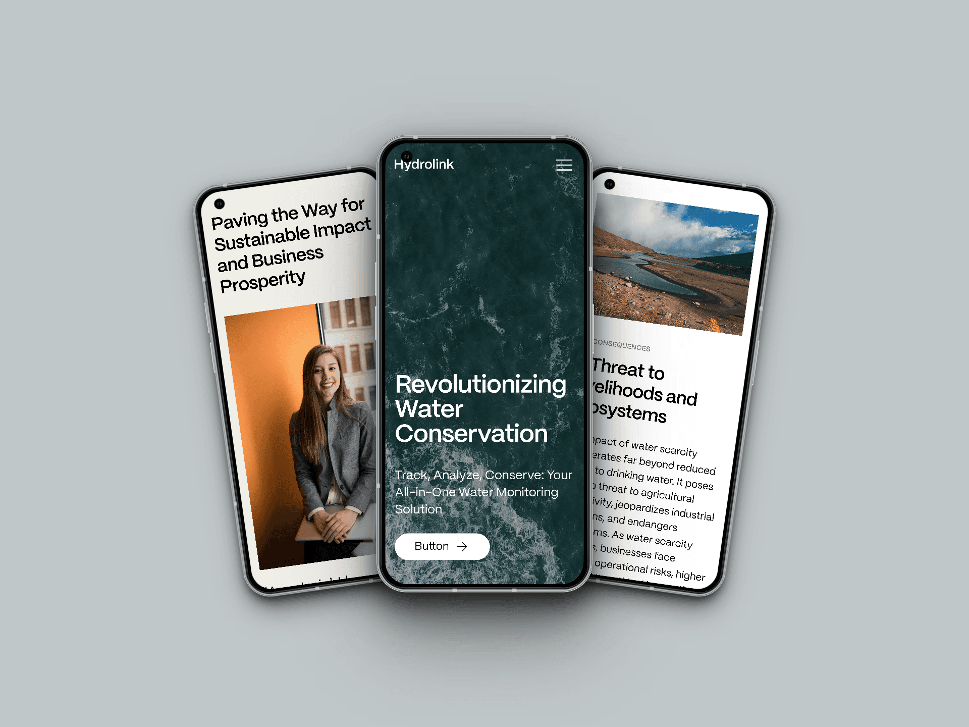
Hyrdolink is a concept based on a water monitoring application for conservation and analysis. Taking inspiration from sustainability/SaaS organizations such as GenCell, Fairsupply, CleanHub, and Wacomet, this one-pager was built to provide an inspiring call-to-action through strong storytelling and framing of the current state of water scarcity. This design emphasizes and showcases clear stats and imagery which then evolves into a solution and value proposition for the presented problem statement.
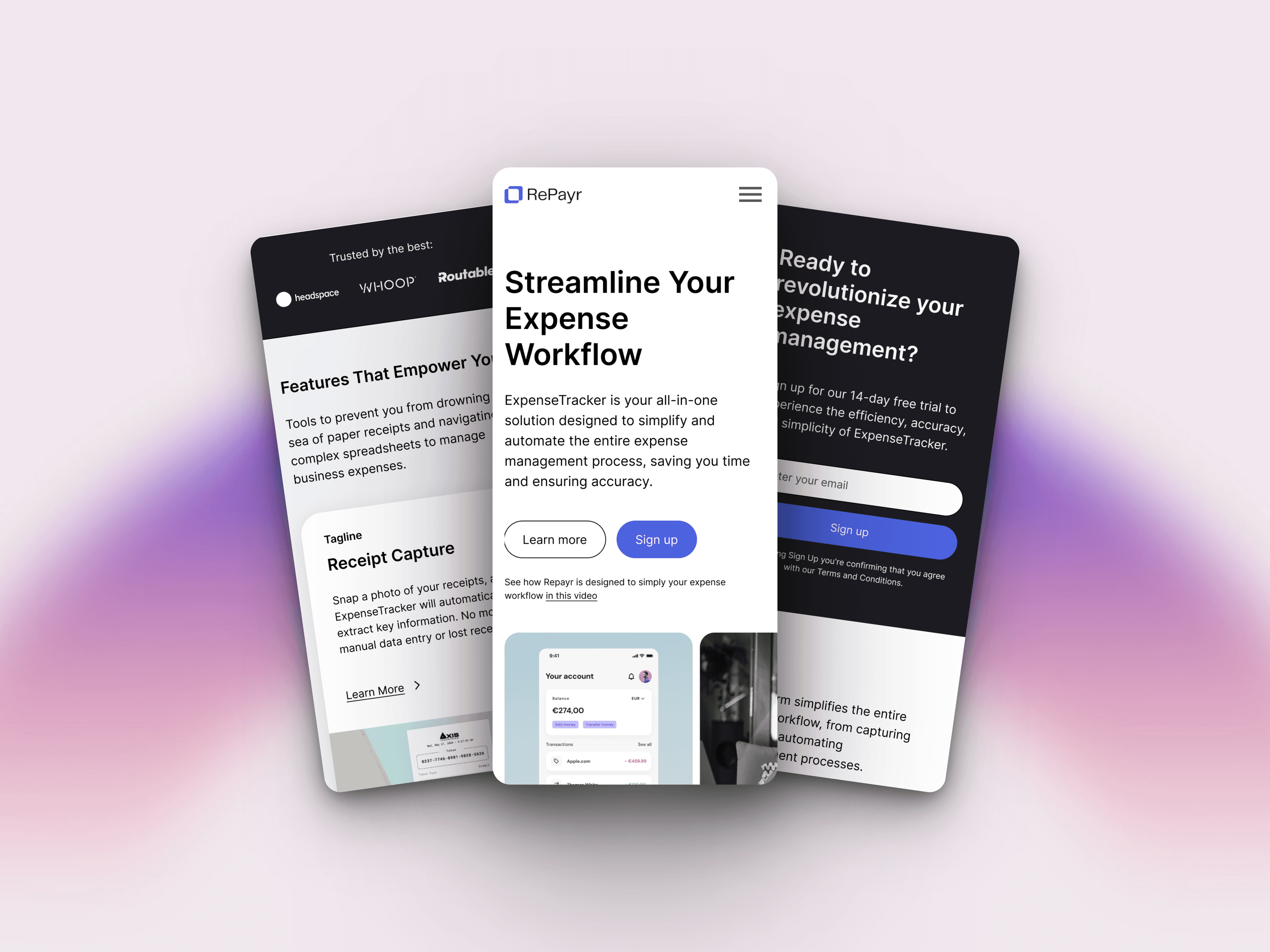
Repayr is a concept based on a business expense management application, taking inspiration from fintech/SaaS organizations such as Square, Rho, Affirm, and Pipe. The goal was to create an atypical hero with a carousel injected above the fold to give the user a complete overview of their product offering immediately upon entry. One of the key aspects of this design was providing the ability to present multiple key messages or features without cluttering the page.
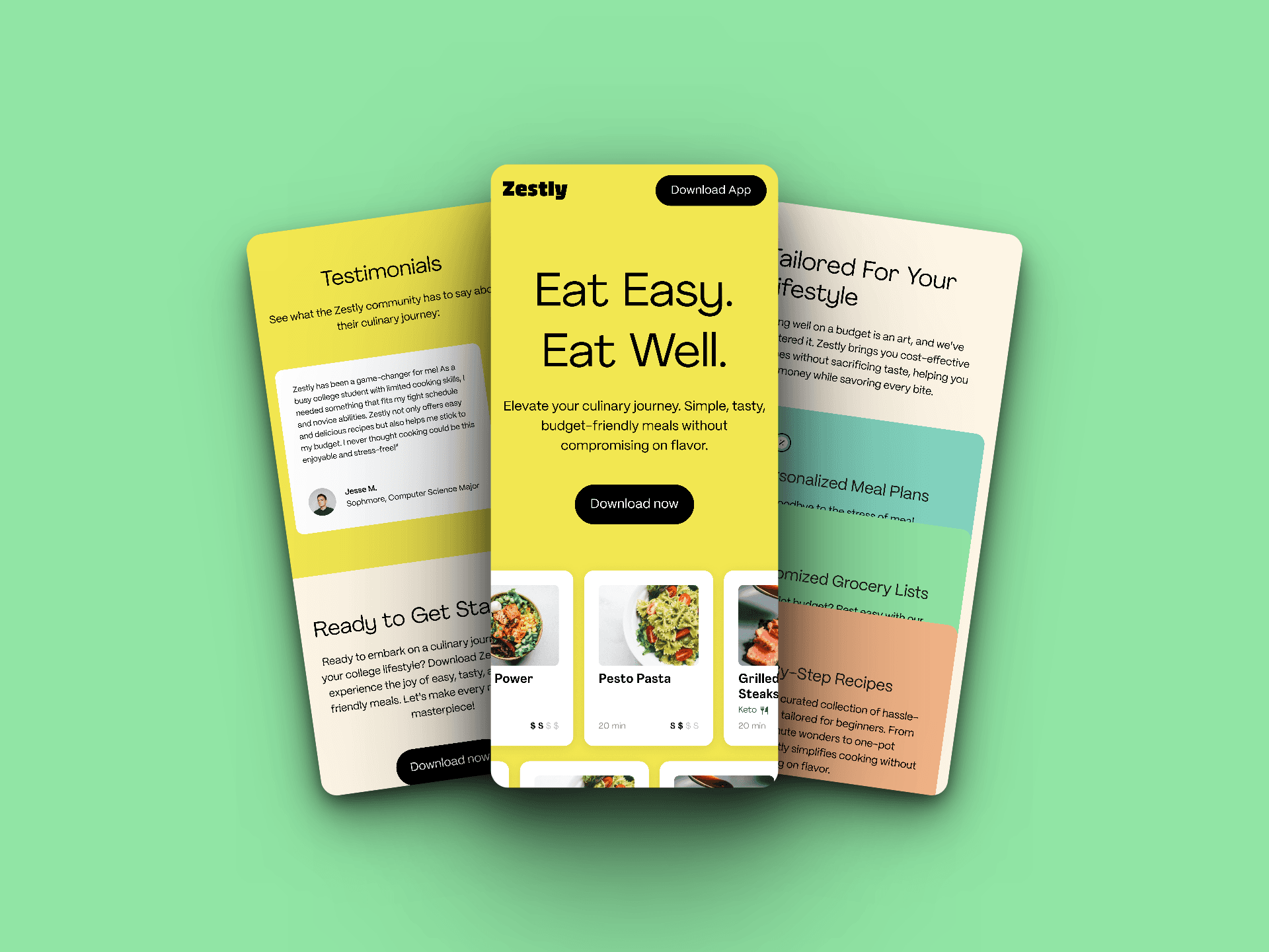
Zestly is a concept based on a budget/meal-planning application. The goal of this simple page was to create a TOF concept that could assess initial consumer interest and boost app installations, focusing on improving conversion rates, minimizing bounce rates, increasing page views, and optimizing CPC. This design highlights the vast catalog of recipes within the app and leverages a strong presence of UGC through galleries and customer testimonials to then lead to a CTA inviting users to install the app.
