Background
The backbone of Viva's product suite was the shopper-facing checkout widget. This allowed either the shopper or Store Merchant to offset the emissions of their orders' carbon footprint. This touchpoint was at the core of the checkout journey and had the promise of not only boosting conversion rates, AOV, but aligning with their sustainably-focused market. An aspect of this widget was a modal that surfaced additional information about the method of offsetting, how it is done, and contextual equivalents to inform the shoppers of what their impact is. It is a important piece of the product and without it, loses important information that highlights the efforts of Viva, the merchant, and the potential actions of the shopper. However, with increasing demand for customization from our merchants, outdated visuals, and confusing messaging, it was time for a change.
Problem
The Next Stage
With a fresh new identity, a newly assembled EPD (Engineering, Product, and Design) team, a robust roadmap, it was time to build. Top of mind was the widget itself. With improved functionality and performance, it was time to address the modal. It no longer matched the visual identity of Viva and was rather disconnected in its' messaging.
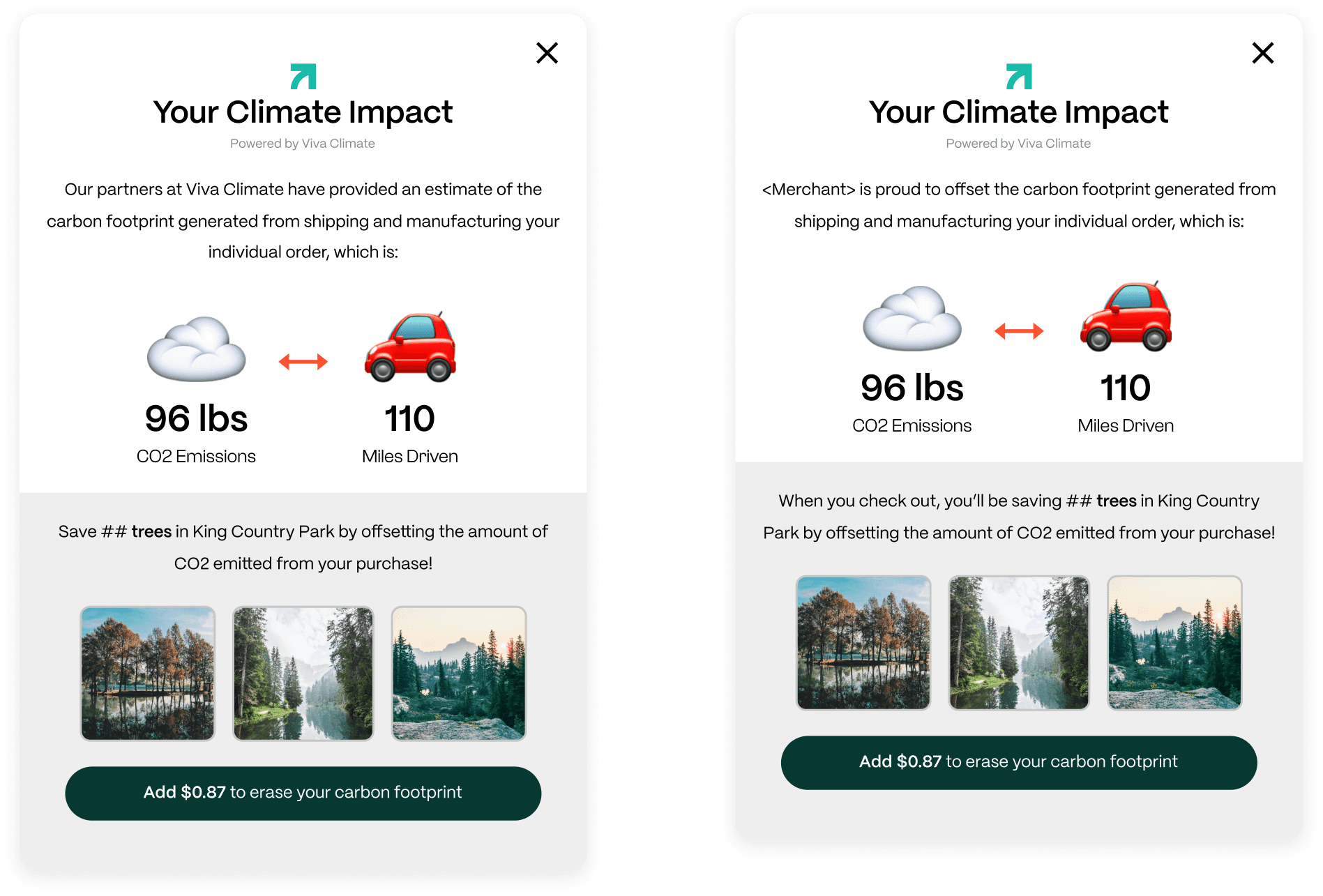
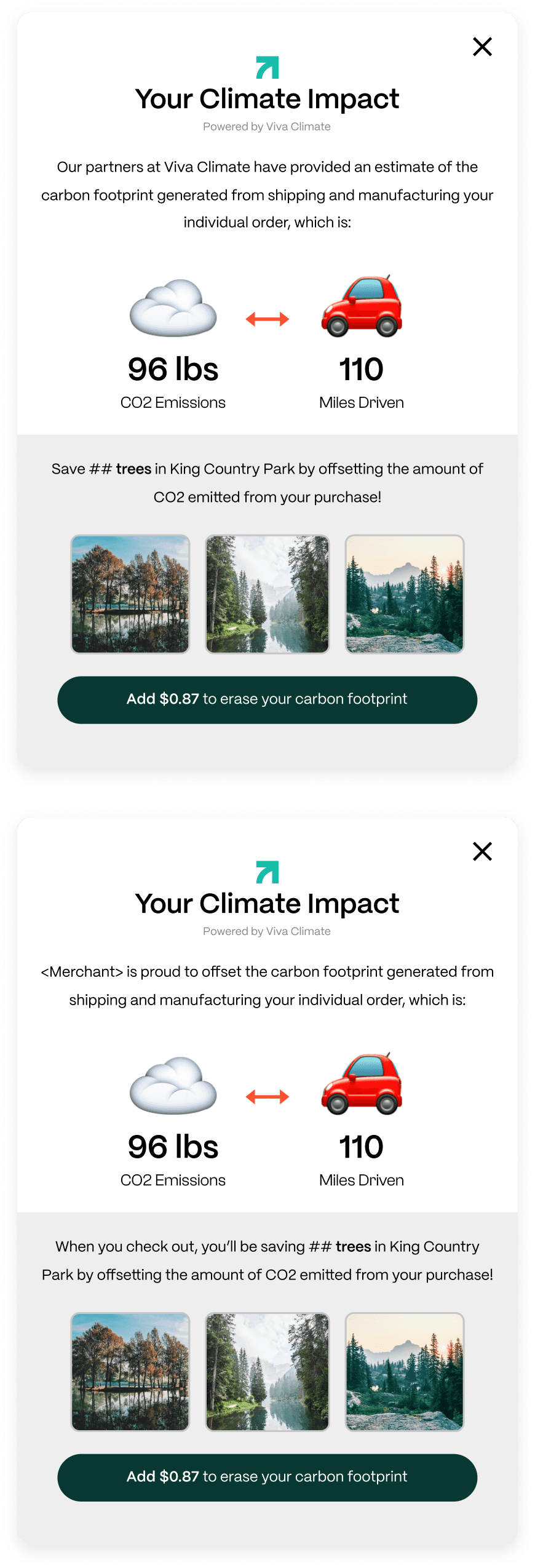
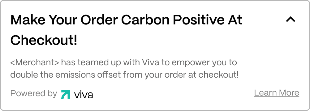
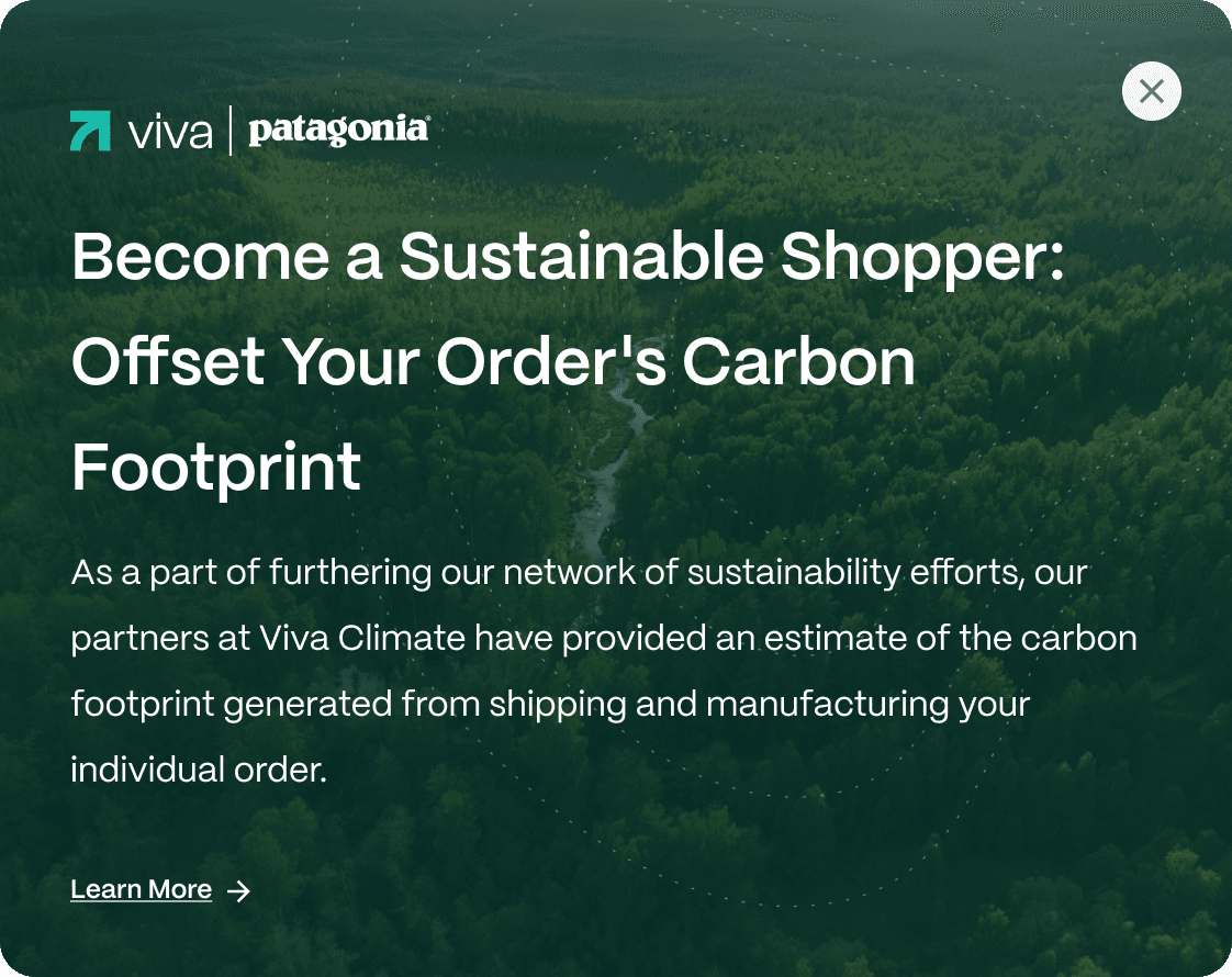
Previous modals with donation methods
Insight #1
Burden of Customization
The demands of a more customized modal became more frequent and disruptive of our bandwidth.
Insight #2

Inconsistent Messaging
Staggered messaging and visuals unknowingly impacted the core messaging of the product.
Insight #3
Lack of Engagement
We gathered that there was very little interaction at all from shoppers. This could have been due to the nature of the touchpoint — users had to take an extra step within their shopper journey to learn more. However, the was initiative to improve that experience as it was apart of the widget experience.
GOALS
Revamp Widget Modal
GOAL #1
Design the overhaul of the widget modal with improved visuals consistent with brand tone.
GOAL #2

Update and refine messaging, ensuring shoppers understand and are primed to merchants' sustainability efforts. This would also be amplified through new data points within our backend tech to ensure accuracy in relaying metrics to the shopper.
GOAL #3

Design for consistency amongst most storefronts and reduce requests from merchants to change significant aspects that stray from Viva's scope of offerings.
GOAL #4
One of the goals was to boost metrics that helped not only our merchants, but Viva as a whole. These include click-through rate, overall adoption, and conversion. Through this engagement, we wanted to empower shoppers with sustainable purchases backed with transparent, real-time data.

phase #1
Conduct competitive analysis research for direct and indirect technologies, assess strengths and weaknesses, and gaps for opportunity.
phase #2
Draft designs and align messaging with shareholders. Some initial versions consisted of a horizontal layout vs vertical.
phase #3
Meet with Engineering to help facilitate the hand off of modal and audit functionality

phase #4

Round up stakeholders, demo prototypes, and align with design decisions.
phase #5

Assist in design handoff and development for backend tooling for internal dashboards. In addition, test and iterate for launch.
Solution
Overview
The end result addressed concerns regarding the messaging format, enhanced functionality, optimized visuals, and utilized input from the cross-functional team to incorporate detailed calculations relevant to the shopper's needs.
Features
A Clearer Call To Action
We wanted to incorporate a story that led to a call to action. This varied based on donation methods, but the overall goal was to provide a compelling narrative and visuals to guide and answer any questions shoppers may have regarding the process of offsetting their order, where the donations go, and contextual data for an extra boost of transparency.
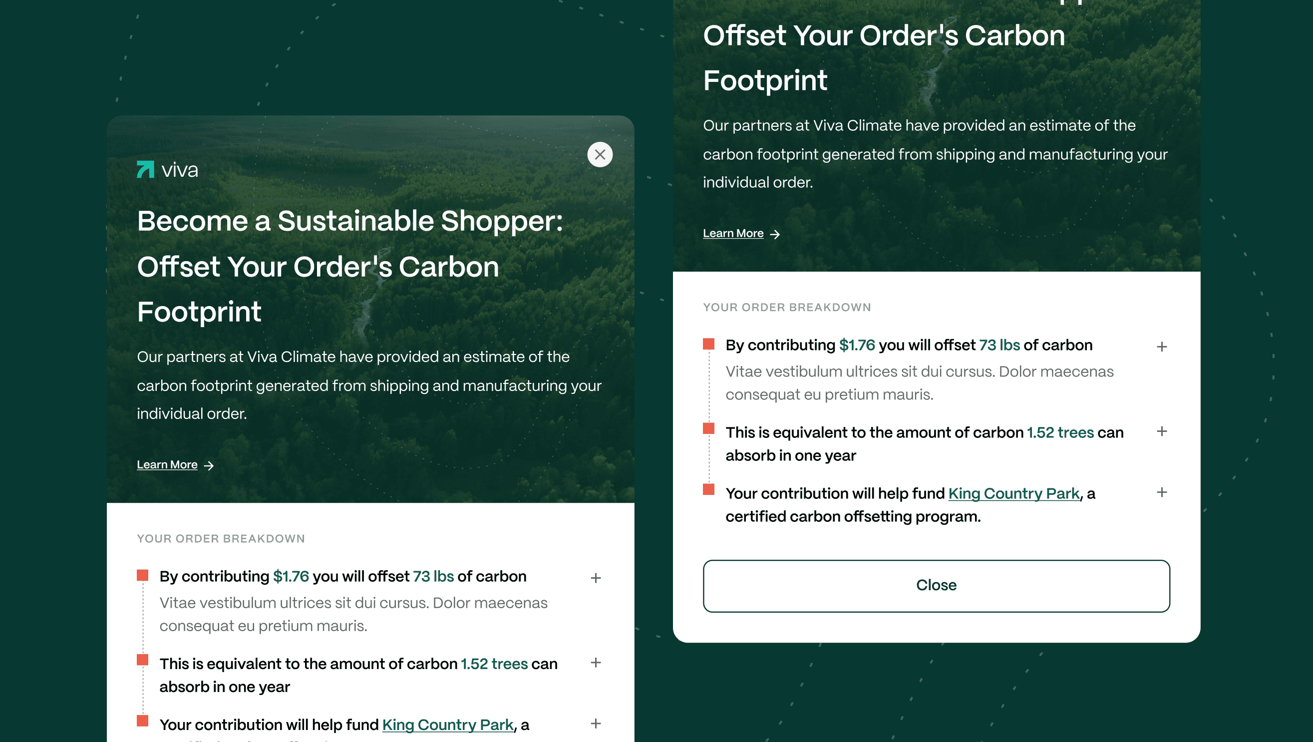
Inclusion of Dropdowns
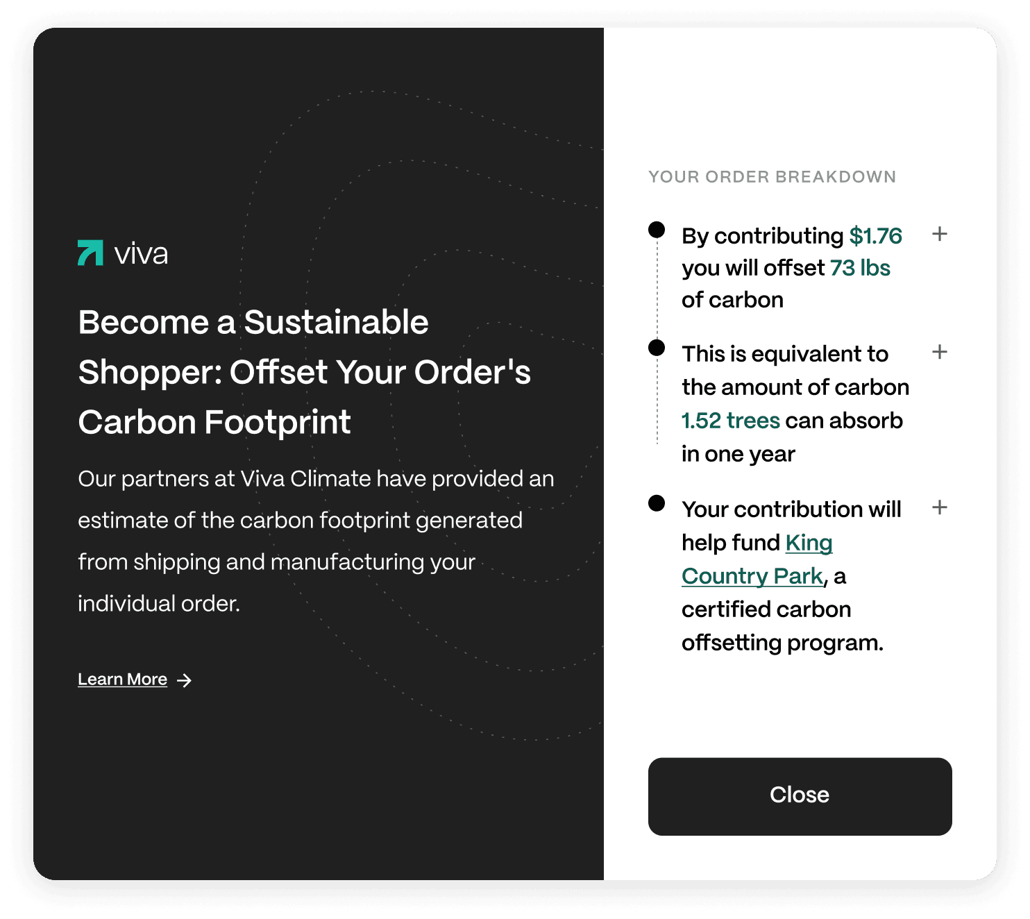
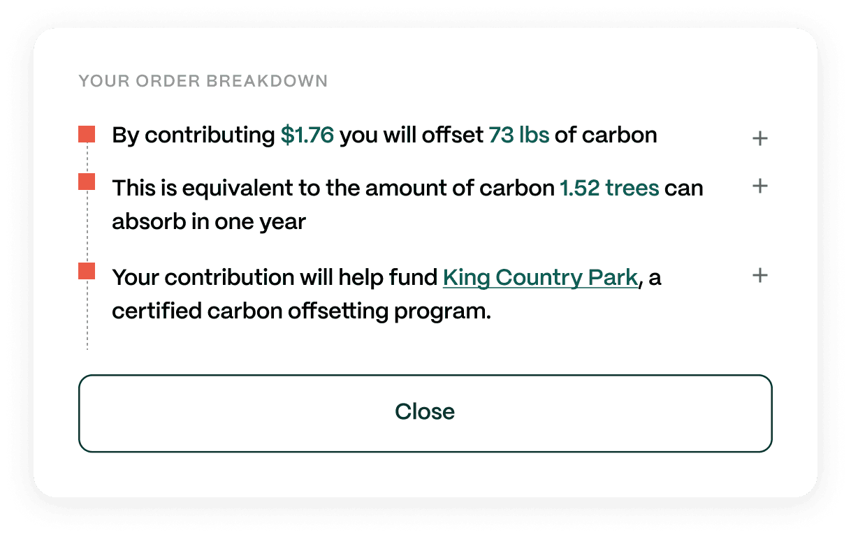
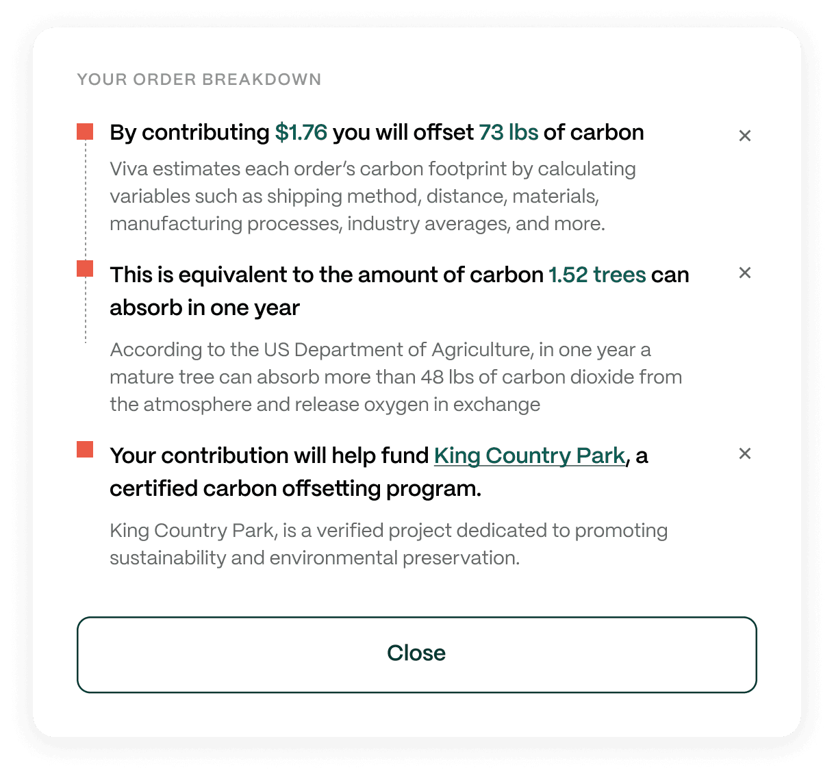
We faced the challenge of needing to convey ample information to the shopper without occupying excessive screen space, which was to be avoided. Our solution involved introducing drop-down menus that offered additional information for those interested, while still ensuring a concise overview in an easy-to-understand sequence. This also gave us the flexibility to add and alter elements later down the road.
Thinking Long Term
The build also considered future features utilizing components from the modal. Simultaneously developing features and expanding the design system aimed at potential uses for future product iterations. Modal or drop touchpoints requiring additional context could be easily reused from this project's foundations.
Merchant Feedback
Merchant feedback highlighted concerns about the perceived starkness due to the absence of imagery and a desire to incorporate Viva into a broader initiative they were pursuing. As a result, a fast follow included imagery of selected project and the inclusion of a sub-header that would be updated within the tooling
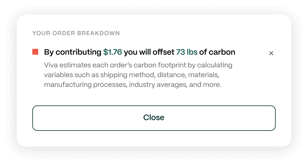
Order breakdown
Structure of Modal
Final Design
Contribution & Impact
This contained dynamic calculations related to numerous variables and the cost to offset. It was important to not only include accurate data but to supplement that with how we arrived to that number
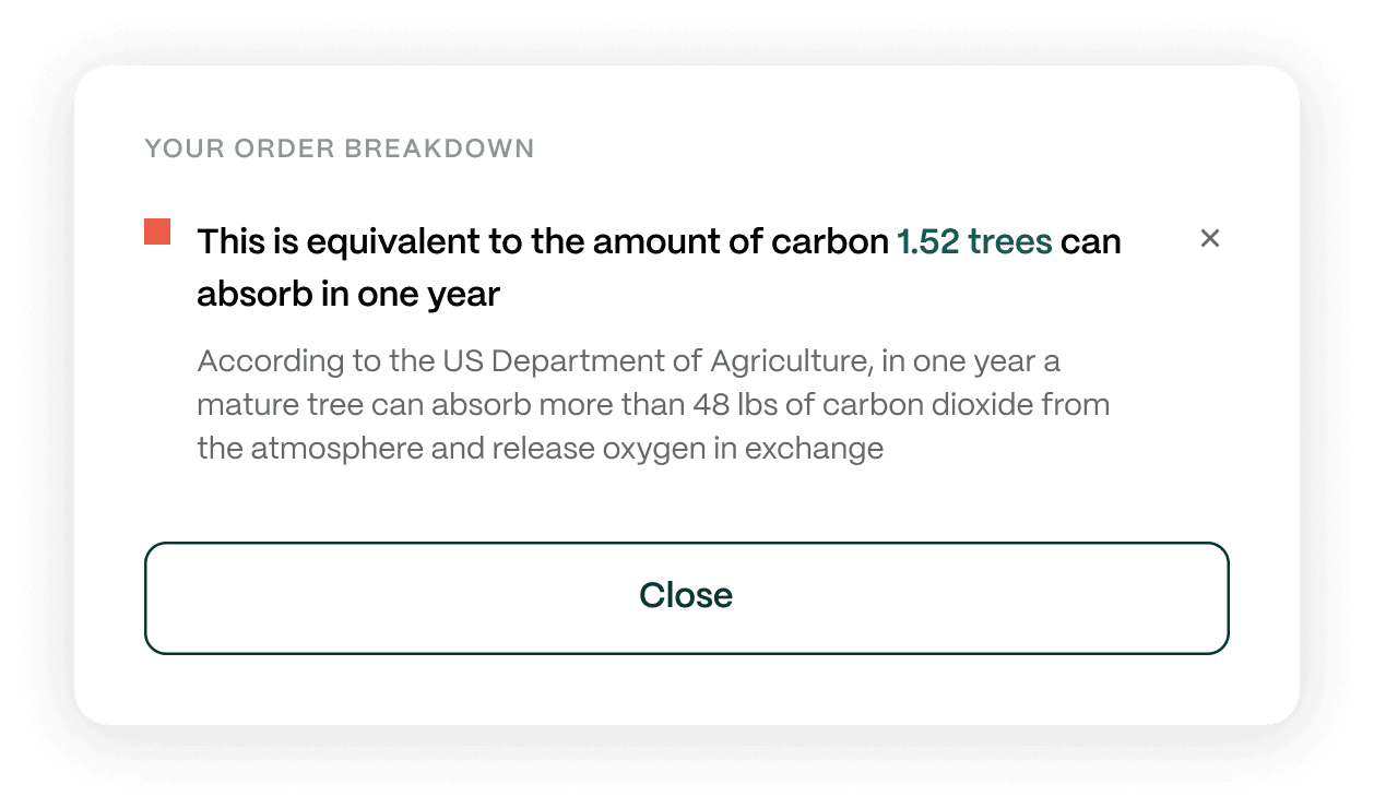
Equivalents
Equivalents, like the older modal, contextualized their impact based on the selected project. Instead of using two equivalents, we used the project to help visualize the impact and leveraging information based on research from valid sources.
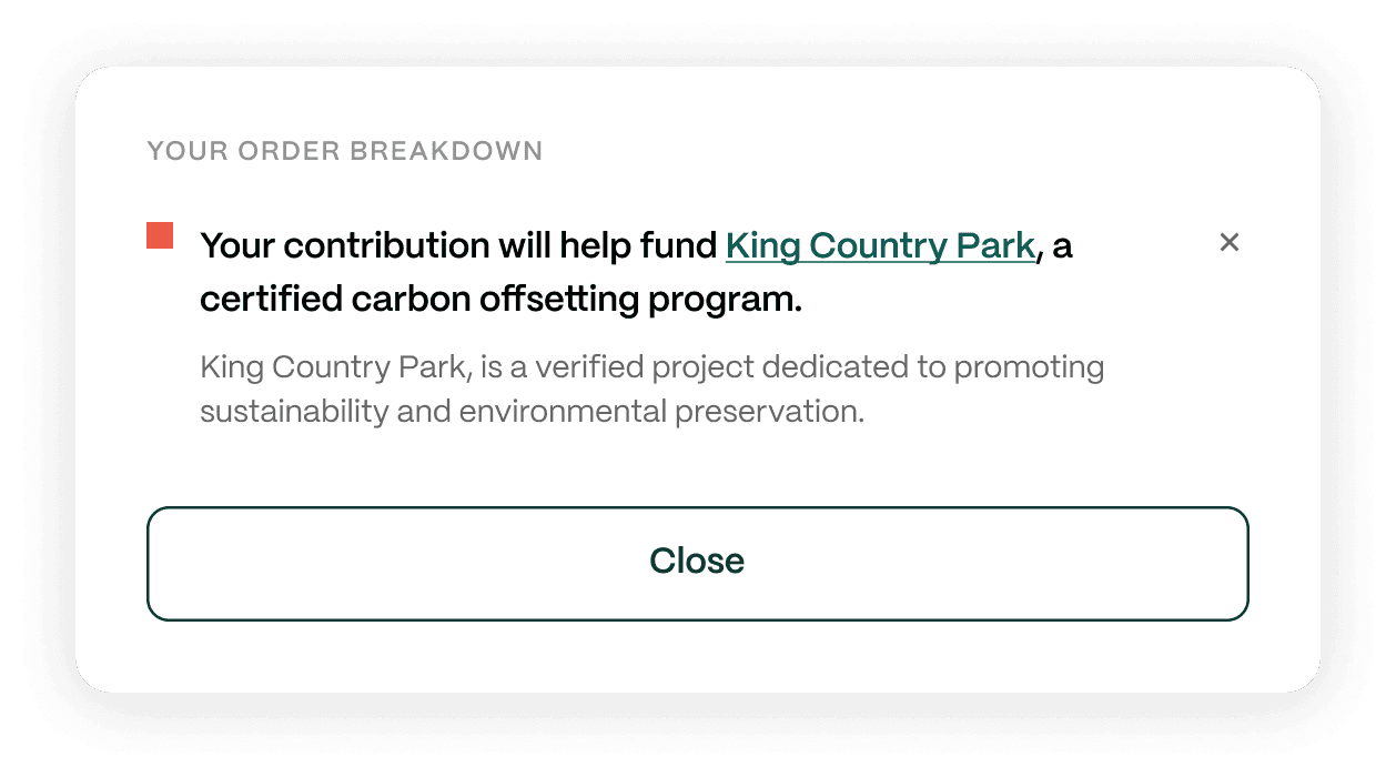
Project Funded
The final element involved project funding, featuring a brief overview of the funded project and a link for further details. This added an extra layer of trust and transparency
Co-Branding Opportunities
An additional feature of the modal that carried from the older version was the inclusion of co-branding. However, we determined this feature be optional and available for higher tiered merchants wanting to have more flexibility with their messaging towards their audience. In addition, we learned that merchants also wanted the ability to include additional information that pertained to their larger contribution, for example, other sustainability efforts outside of Viva.
Mobile Experience
outcome #1
Reusable Components
We were able to incorporate design patterns with the inclusion of dropdowns for multipurpose use cases for later projects down the road.
outcome #2
Ability to Track Performance
With the ability to track performance, an aspect we did not have prior, there were now opportunities we could find through the performance and overall tracking of the modal.
Outcome #3
Decreased Customization
One of the more important wins of this project was the lessened requests for customization. This alleviated the burden from multiple teams such as engineering, customer success, and marketing which gave them bandwidth to focus on other items.
LESSON #1
Power of Research
The research that informed the initial designs was highly based on the functionality of adjacent products such as Affirm or Klarna, while we functioned differently, it was important to understand how certain design patterns could improve usability for shoppers who were also familiar with those products. This stage allowed us to think outside the box and consider some unique solutions.
LESSON #2
Cross-functional Input is Good!
This little modal was on a lot of digital collateral and was being shared within sales and marketing funnels. As a result, we got a lot of input as to what were building that their input helped greatly with validating the direction of this design within its lifecycle.
LESSON #3
Improve As You Go
This project was among the first to adopt a newly established hand-off workflow, enabling us to enhance communication with Engineering. For instance, handing off the specifications for the drop-downs was an insightful process, as it required addressing slight nuances in functionality, and facilitating refinement for future specification documentation.

